- Platter Newsletter
- Posts
- Obvi improved PDP add-to-cart rate by 10%
Obvi improved PDP add-to-cart rate by 10%
Five structural changes Obvi made that any Shopify brand can learn from.
Cam Wind
January 15, 2026

If you spend any time in DTC, you know of Obvi.
They’ve hit $100M in sales, built a 100,000+ member community, and turned creators into a real moat — all since launching in 2019.
But as the brand scaled, they outgrew their Shopify store. It really hadn’t changed since their early days and it was time for a facelift.
We got connected with the Obvi team back in 2025 when they were looking for a redesign. We helped them create a new store and they hit publish ahead of Q4 last year.

Obvi founders Ashvin, Ronak, and Ankit.
In today’s issue I’m going to break down what specifically changed, why, and what operators can steal from this rebuild.
Quick side note before we dive in.
If you want to hear this story directly from Obvi’s founder, Ben released a great YouTube episode with Ron a couple months back. Give it a watch.
Alright, let’s jump into the newsletter.
A look inside Obvi’s new Shopify store
The backstory
Obvi has been building for over six years.
As the brand expanded beyond its original hero products, the catalog grew. Like most fast-growing DTC brands, they layered on changes to their Shopify store over time.

Obvi's old homepage
Ronak Shah, CEO and Co-Founder, put it this way:
“Pretty much everything was going wrong… We kept adding products and tools and just put them wherever they fit. Over time, the site turned into what I’d call a dump yard of products and plugins.”
Customers were still buying lots of product, but behind the scenes things were starting to become real blockers for the team:
the design felt outdated compared to Obvi’s current packaging and brand
key page sections were hard to update or reuse
product pages were really long without much structure
the cart relied on third-party apps that didn’t work great
and the core storefront couldn’t handle paid traffic
The number one goal was to modernize the store, restore structure, and give the Obvi team a foundation that could help them crush their growth goals.
Let’s look at the specific issues inside their old store and exactly how we helped to solve them.
5 specific issues with the old store (and what we changed)
1) Page sections were using image blocks
The problem: A lot of the “design” on key pages was essentially one long screenshot. So while it looked consistent visually, the team had no flexibility with their store.
That meant:
copy updates had to be done in image editors then uploaded
sections couldn’t be reused cleanly across products
you couldn’t easily move pieces around

Large parts of Obvi's old store relied on image blocks for layout and content
How we fixed it: We rebuilt the layout using modular Shopify content blocks so Obvi could update sections, swap content, and build new pages without rebuilding from scratch.
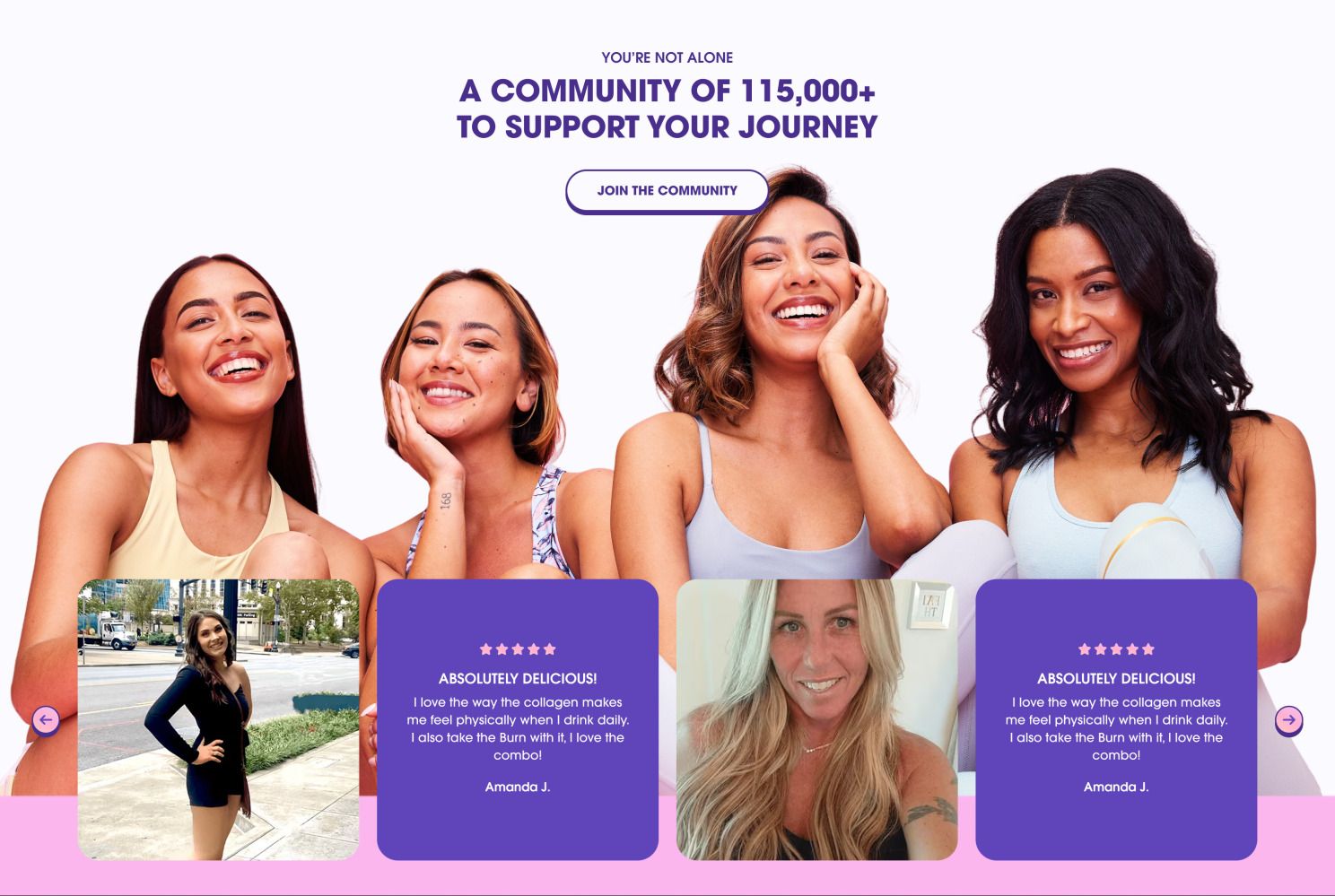
Community content block
2) PDPs were lacking structure
The problem: Obvi’s PDPs needed to educate (ingredients, benefits, timelines, proof). But the old format didn’t guide shoppers through that story.
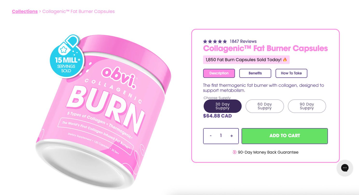
Their old buy box
How we fixed it: We built a structured PDP system with reusable sections (benefits, ingredients, FAQs, testimonials, education). Each section can be toggled per product, so their hero SKUs can go deep, and smaller SKUs can stay lean.
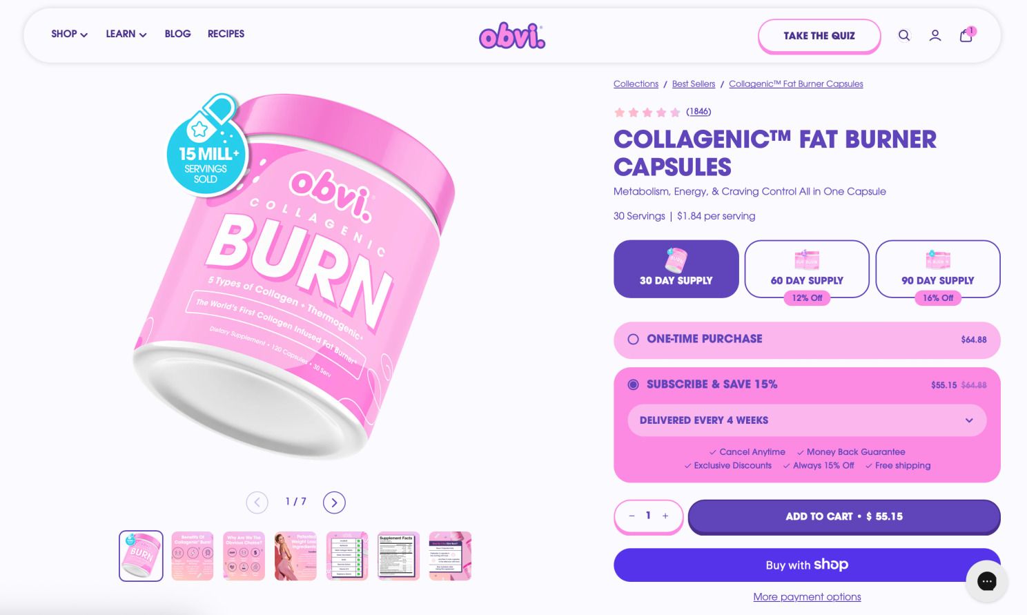
Their new buy box
3) Scroll fatigue was real
The problem: Obvi has passionate customers, but first-time shoppers need clarity fast. When a PDP becomes a wall of content, attention drops.
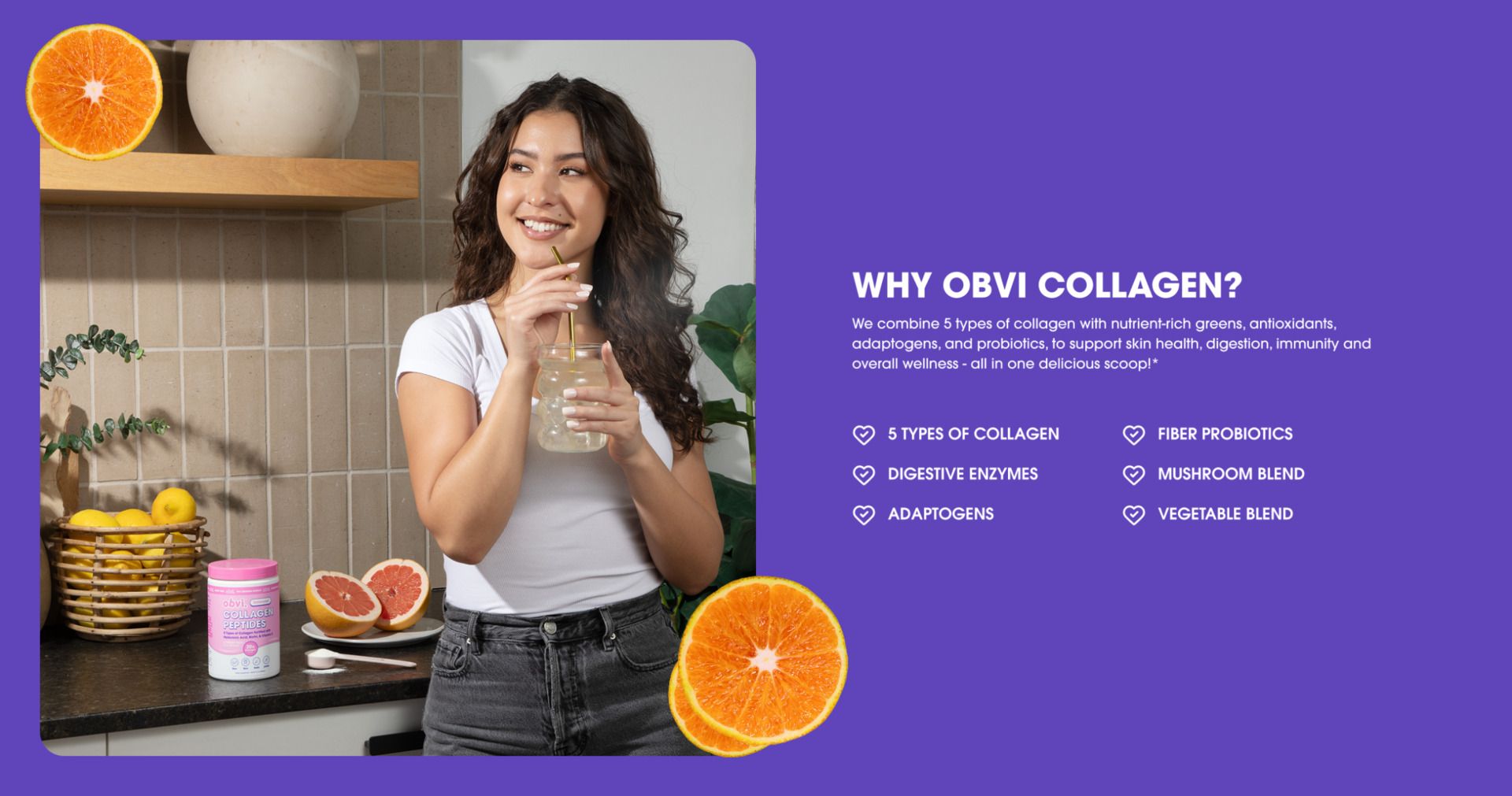
How we fixed it: We made sure to keep detail, but changed the format. We added things like ingredient education blocks and interactive modules instead of static stacks of text blocks. Same information, way easier to consume.
4) The cart wasn't optimized
The problem: Their custom cart setup was described internally as “janky.” Not broken, just not the kind of cart experience the team wanted.
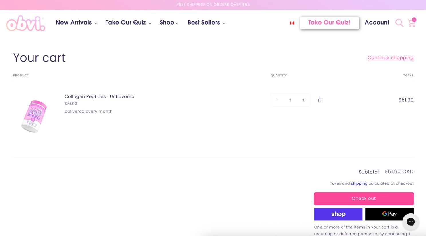
Their old cart
How we fixed it: We replaced it with a native cart drawer built into the Platter theme and added a “complete your set” cross-sell experience inside the cart, so add-ons feel natural, fast, and on-brand.
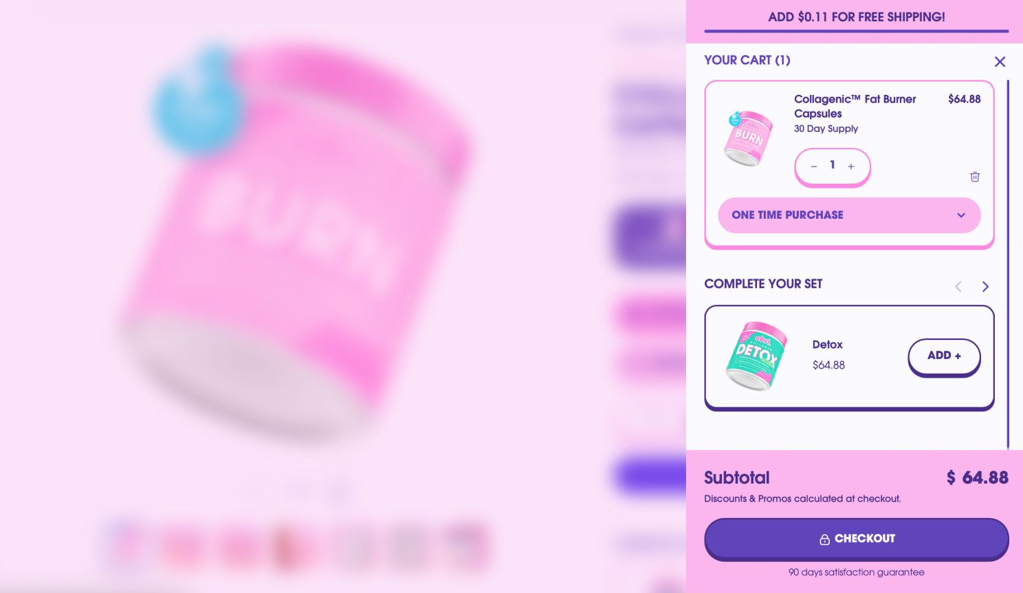
The new cart drawer
5) Results were hard to visualize
The problem: Obvi is really selling outcomes. But outcomes don’t land the same when they’re buried halfway down a page or only shown as static images.
How we fixed it: We added a before/after compare slider so shoppers can interact with transformation imagery instead of passively scrolling past it.
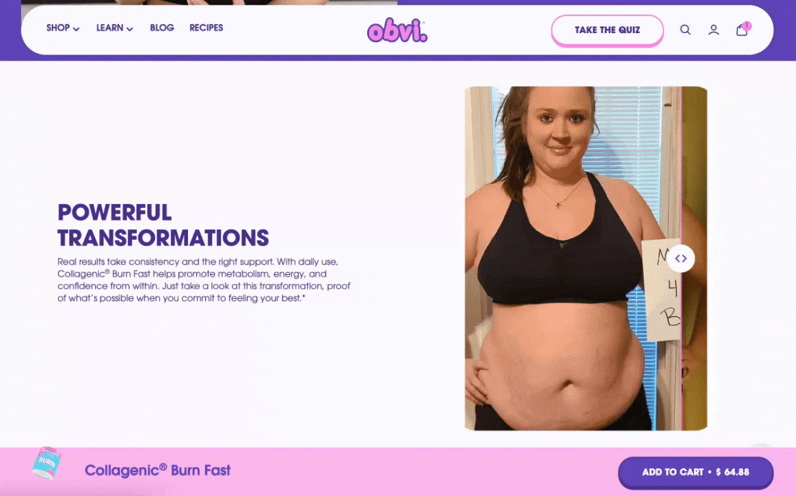
Before and after slider
The big win for Obvi
With this rebuild, the team was focused on making the storefront faster, easier to use, and strong enough to support a brand operating at Obvi’s scale.
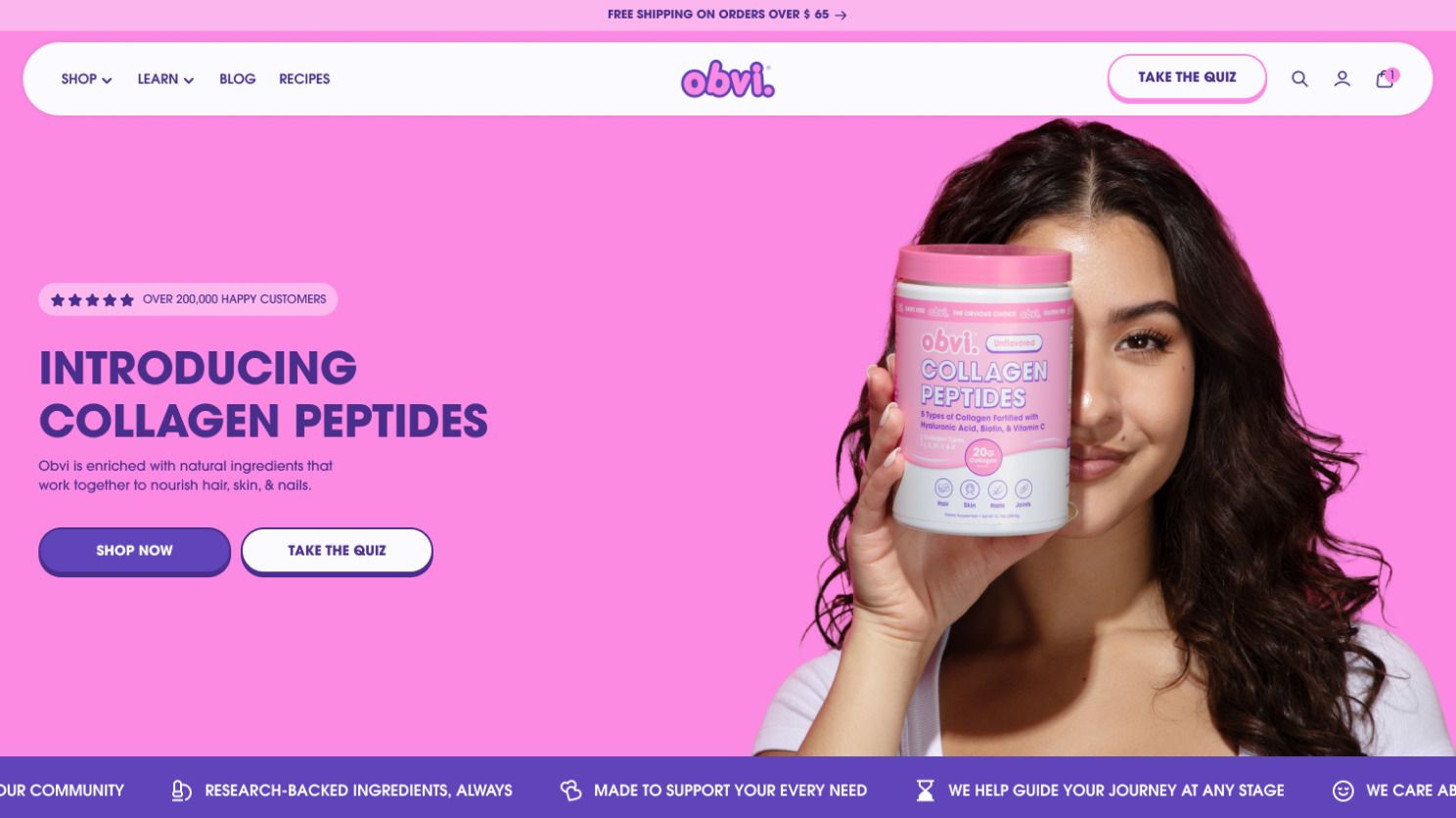
Their new homepage
There are two clear performance improvements tied directly to the rebuild:
LCP improved from 3292ms → 2865ms after the new theme launch
Add-to-cart rate from PDP landings increased 10% compared to the previous period
In simple terms: when shoppers land on Obvi’s product pages, the experience is faster and more effective.
The biggest win for the team has been having a store that looks good and is easier to manage.
As Ron put it:
“Traffic is more expensive than ever. You can’t just build a site that looks good. It has to perform, be easy to test, and give you control. That’s what we got with Platter.”
That confidence changes how a team operates.
If your Shopify store works, but feels harder to operate than it should, it might be worth taking a closer look.
Most teams don’t need a full rebuild. They just need clarity on what’s slowing them down.
If you want an honest, no-pressure store audit, reply to this email or book a call and our team will take a look.
– Cam
 | Hi, I’m Cam. I write about what’s happening across the Shopify ecosystem and share stories as Platter builds world-class Shopify stores. If you ever want to chat about your store, reply anytime or find me on LinkedIn. |