- Platter Newsletter
- Posts
- Nobody optimizes this page (and it's costing them)
Nobody optimizes this page (and it's costing them)
Why most Shopify collection pages underperform, plus Danone just bought Huel for ~€1B and Ben's latest video.
Cam Wind
March 27, 2026

Happy Friday,
If you’re anything like me, half of your LinkedIn feed is in Vegas this week for Shoptalk. And the other half is posting about it from their couch.
I’m firmly in the second camp.
No new store launch to break down this week, so instead I’m zooming out and sharing some insights about something that isn’t often talked about: collection pages.
Specifically, what we’ve learned from building hundreds of them.
Let’s get into it.
What’s in this issue:
What 200+ store builds taught us about collection pages
Danone just bought Huel for ~€1B
Ben’s latest video on scaling a $3M agency
DEEP DIVE
What 200+ stores taught us about collection pages
Brands obsess over their homepage. They agonize over the PDP. They redesign their cart drawer every few months.
Collection pages? They get the default grid and a filter sidebar. Maybe a banner at the top if the team is feeling ambitious.
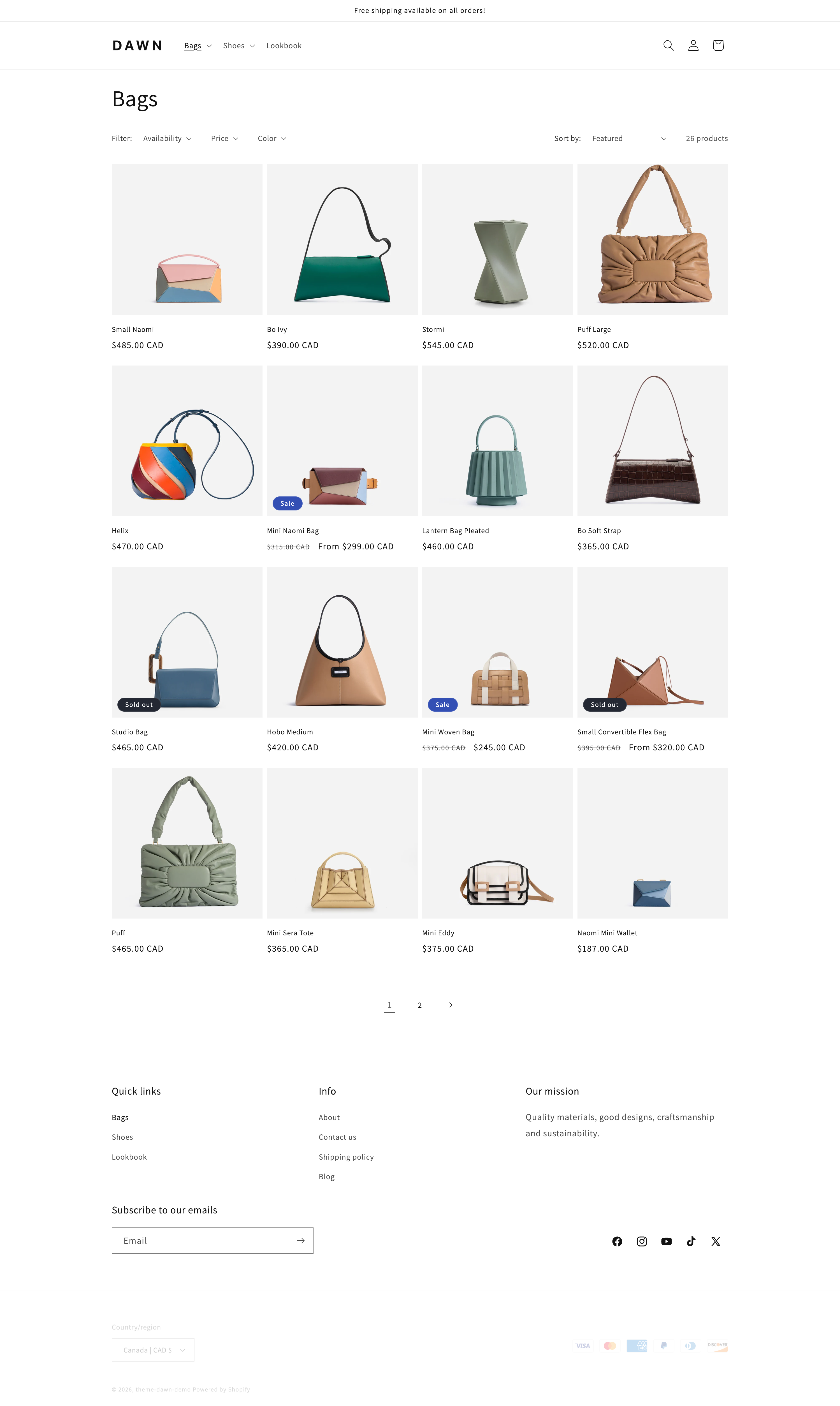
The default collection page layout in Shopify’s Dawn theme
For a lot of stores, especially ones running paid traffic, the collection page is where lots of customers land. And how it’s designed impacts conversion rate.
After building 200+ stores, and auditing hundreds more, a few patterns keep showing up.
1. Different traffic sources need different layouts
This was one of the biggest unlocks on the Pinned Golf build.
Pinned Golf sells rangefinders, GPS tablets, and Bluetooth speakers. Every product comes in multiple colorways. When someone arrives from Google organic or the homepage, they want to browse. They’re exploring.
But when someone clicks a Meta ad for a neon green rangefinder, they want to find that exact product and buy it. They’re not browsing. They’re deciding.
So we built two collection page layouts:
A standard view with color swatches on each product card. Fewer cards, cleaner grid, ideal for organic browsing.

A color-focused view where every colorway appears as its own card. More visual, faster decisions, designed as a landing page for paid traffic.

Same products. Two totally different shopping experiences. One collection page template doesn’t fit all traffic sources.
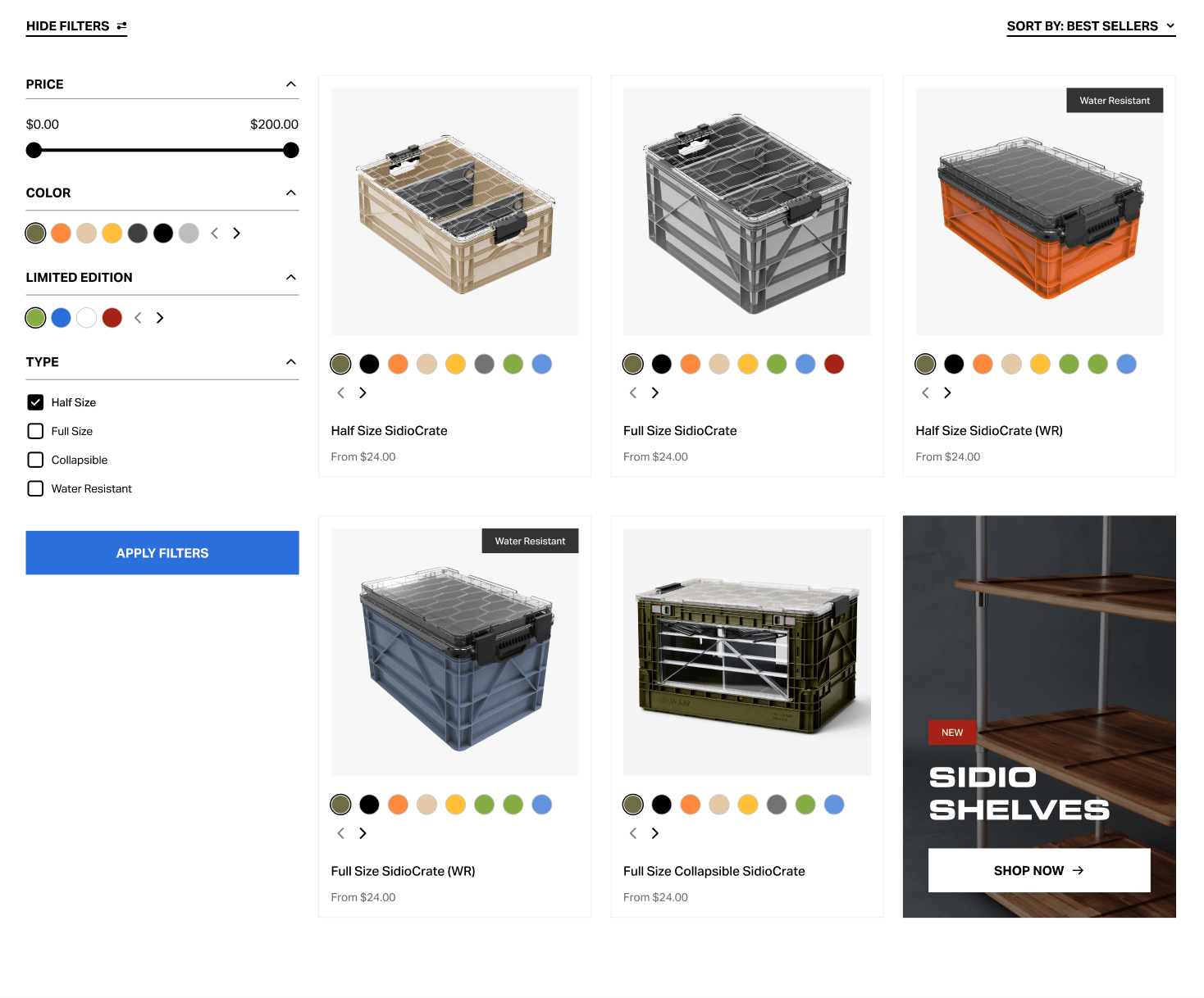
2. Variant clutter is killing your grid (but not always)
This one is common. We saw it on Pinned Golf before the rebuild. We saw it on SIDIO’s store. We see it on almost every store with more than a few colorways or sizes.
The default behavior on Shopify is that every variant either hides behind a dropdown on the PDP, or gets its own product listing on the collection page. Neither is great out of the box.
When SIDIO had individual listings for every variant, their collection pages were cluttered with 15–20 cards that were basically the same product in different colors. It made browsing overwhelming and diluted the catalog.
The fix in most cases is color swatches at the card level. One product card, multiple colorways visible, cleaner grid.
But — and this is the nuance — there are times when you want individual listings for every variant. That’s exactly what we built for Pinned Golf’s paid traffic layout (see tip #1). When someone clicks an ad for a specific color, you want that color front and center as its own card.
The difference is intention. SIDIO’s variant clutter was a Shopify default that nobody had thought through. Pinned Golf’s color-focused view was a deliberate design choice for a specific traffic source.
One is a problem. The other is a strategy. Know the difference.
3. Your collection page should sell, not just list
This is the one that most brands miss entirely.
A typical collection page has a header, a product grid, and filters. That’s it. It’s a catalog page. It organizes products but doesn’t help anyone decide what to buy.
The Absorption Company does this really well on their foundational supplements collection.
Instead of just listing individual products, they use the collection page to:
Plug their stacks and bundles alongside individual products, so customers see the recommended combinations right where they’re shopping
Include FAQs directly on the collection page, answering common questions about the product category without making the customer click into a PDP first
Add educational context about what the collection is, who it’s for, and how the products relate to each other

Most collection pages assume the customer already knows what they want. For brands selling supplements, skincare, or anything where education drives confidence, the collection page is the perfect place to do that work.
If your customer has to click into three different PDPs to understand which product is right for them, your collection page isn’t doing its job.
4. Filter and sort UX matters more than you think
This one applies especially to stores with larger catalogs. Supplement brands in particular.
When a brand like Gains in Bulk has dozens of SKUs across different benefits, formats, and flavors, the default Shopify filter experience falls short. Filtering by “product type” or “price” doesn’t help someone who came to your store looking for something to help them sleep.
The brands that get this right filter by use case and benefit, not just product attributes. “Best for muscle gain.” “Best for fat burn.” “Best for recovery.”

It sounds obvious, but most stores we audit are still using Shopify’s default filter options. A few minutes of setup here can meaningfully change how people navigate your catalog.
TL;DR
Match the layout to the traffic source. Clean up variant clutter unless you have a strategic reason to show it. Add content that helps people decide, not just browse. And set up filters that match how people browse your catalog.
NEWS OF THE WEEK
Danone acquires Huel for ~€1 billion
Big news in the DTC nutrition world.
Danone announced they’re acquiring Huel, the complete nutrition brand, for roughly €1 billion. Huel was founded in 2014, has built a strong direct-to-consumer channel, and expanded across the UK, Europe, and the US.

The deal is part of Danone’s push into functional nutrition. They’re buying distribution, a loyal subscriber base, and a brand that figured out how to sell meal replacements directly to consumers at scale.
For DTC operators, the signal is clear: big CPG is paying premium multiples for brands with strong direct channels. Your storefront isn’t just a sales tool. It’s part of the valuation story.
In completely unrelated news, Ben has a Huel fridge in his apartment. No word yet on whether Danone is acquiring that too.
CONTENT OF THE WEEK
Scaling Platter to $3M ARR in NYC
Ben’s latest video is an honest look at what it takes to scale an agency to $3M in New York City. The wins, the losses, and what nobody tells you about growing a service business.
That’s it for this week.
If you’re at Shoptalk and want to talk shop (pun very much intended), or you’re staring at your own collection pages and seeing some of the issues I wrote about today — hit reply or shoot me a DM on LinkedIn.
See you next week. ✌️
 | Hi, I’m Cam 👋 I write about what’s happening across the Shopify ecosystem and share stories about Platter. If you ever want to chat about your ecom store, hit reply or find me on LinkedIn. |