- Platter Newsletter
- Posts
- How Sidio fixed their six-figure PDP problem
How Sidio fixed their six-figure PDP problem
From sticker shock to a cluttered catalog, Sidio’s store had hidden problems. We unpack how it all got fixed.
Cam Wind
December 04, 2025

Hey, it’s Cam 👋
Hope you're having a good week so far.
Today I'm doing a full breakdown of Sidio's Shopify store. This one’s fun. I am a big fan of the brand and the store.
We first connected with Trevor Carlson back in 2024. He had just published a brand new Shopify store. But after just three months, he realized the new store was hurting sales more than it was helping. So he made the crazy decision to build a new one!
Today’s issue breaks down the full story and how Platter helped them fix it.
Let’s get into it.
The backstory
Sidio sells modular storage crates and their customers love them. Roughly half of all orders come from returning shoppers and their AOV sits around $200 when volume discounts are active.
On paper, everything looked solid. They had published a brand new Shopify store three months prior. But as they pushed through a big sales period last year, they quickly realized they had a problem.
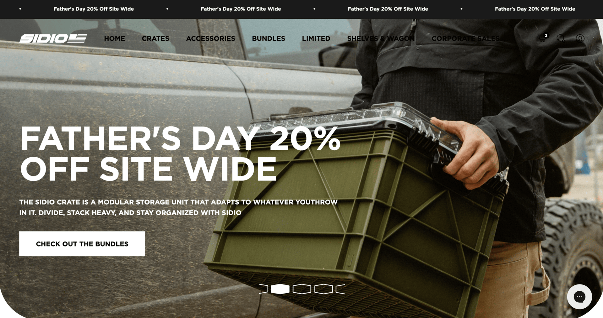
Sidio’s old homepage.
Their PDPs defaulted to the most expensive configuration, the media galleries showed every variant all at once, and the catalog spread colors and accessories across separate listings. Shoppers landed on product pages that felt messy, saw prices they didn’t expect, and couldn’t find the configurations or add-ons they actually wanted. That moment of “sticker shock” alone reportedly cost the brand “hundreds of thousands of dollars”.
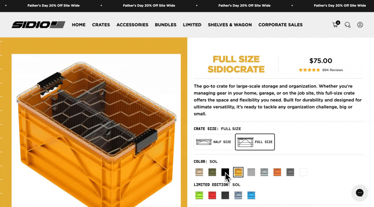
Sidio’s old product page.
This issue breaks down how we uncovered the problems inside their buying experience, how we rebuilt the journey from PDP to navigation, and how those fixes made the product feel clearer, more trustworthy, and easier to shop.
5 of the biggest issues with the old store (and how we fixed them)
Once we got into their admin, it became clear that the problems weren’t just cosmetic. The UX wasn't designed for how customers actually buy and configure their crates. Everything was harder than it needed to be.
Here were the big issues we focused on solving.
1. Pricing that created instant “sticker shock”
Sidio’s PDPs always loaded the most expensive configuration first. Lids and dividers were pre-selected, and the discounting logic wasn’t fully synced with what shoppers saw. People landed on the page, saw a price much higher than expected, and bounced.
How we fixed it:
We rebuilt the PDP so every shopper starts with the true base crate. Upgrades only appear when people intentionally select them. We also built a custom volume discount block and wired it directly into Shopacado so the pricing, quantity breaks, and “buy more, save more” messaging all match what shoppers actually get.
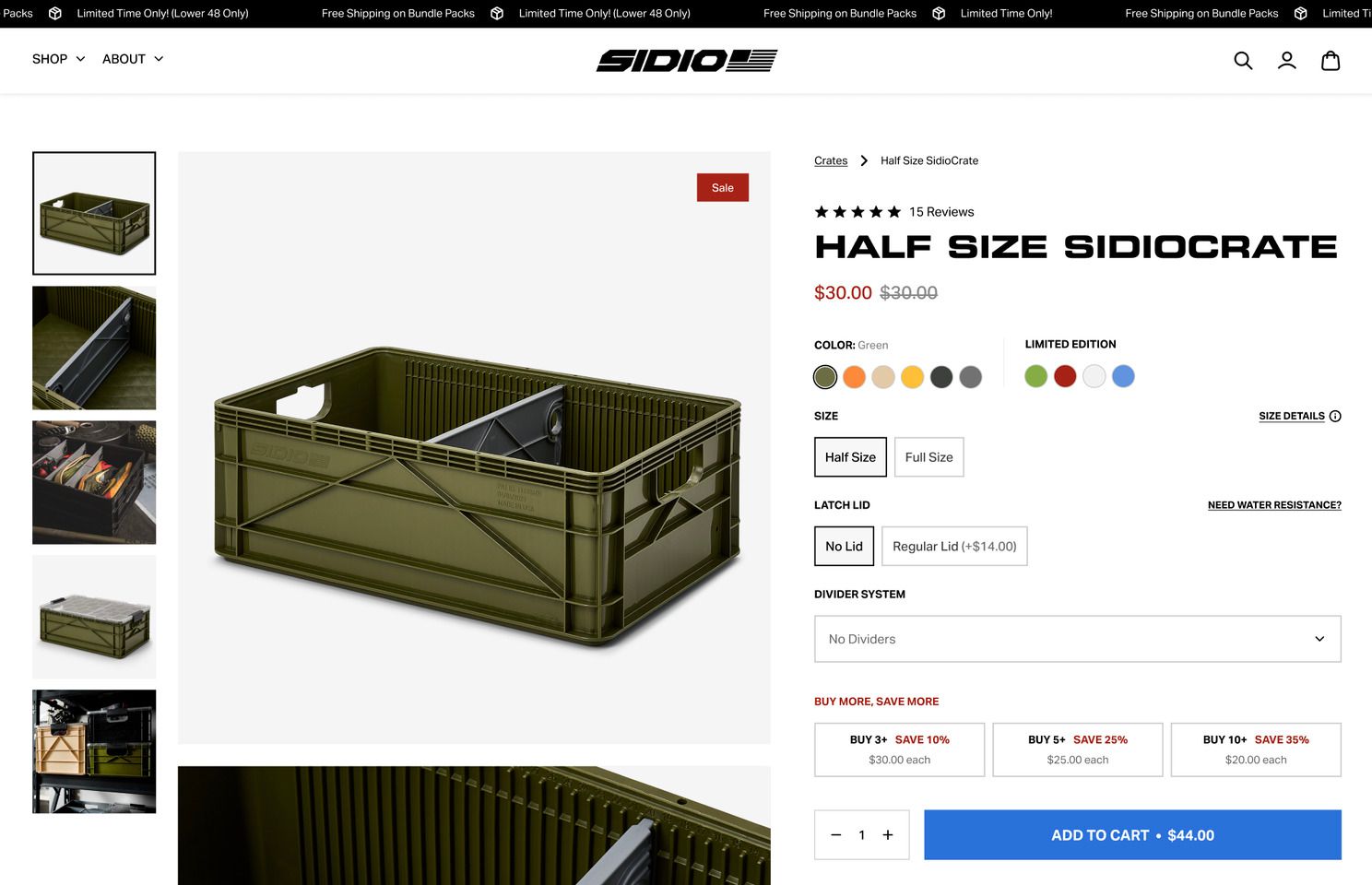
The updated product page design.
2. A media gallery that overwhelmed people
The old gallery had every image for every variant in one giant feed. That meant size changes, lid changes, divider changes, and every color all appeared together. The media gallery looked “fake”, like a wall of renders with almost no real-life context. Because there were so many images, lifestyle shots were almost always missed by shoppers.
How we fixed it:
We cleaned up the gallery with structured image rules. The main image dynamically changes based on the selected color option and images for other color variants are hidden from the gallery. The lifestyle images stay in view so shoppers can see the product in real environments.
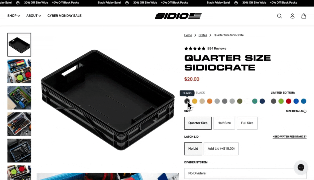
The new media gallery.
3. A catalog with tons of products
Colors, water-resistant versions, and accessories were treated like separate products. Collection pages showed every variation of the same crate, spread across different tiles. It overwhelmed customers and made it difficult to find the right product.
How we fixed it:
We reorganized the entire catalog around how customers shop. Each core crate type appears once. Colors live as variants. Water-resistant options follow a similar structure. Accessories are offered as complementary options and accessible in easy-to-find pages. Discovery feels much simpler.
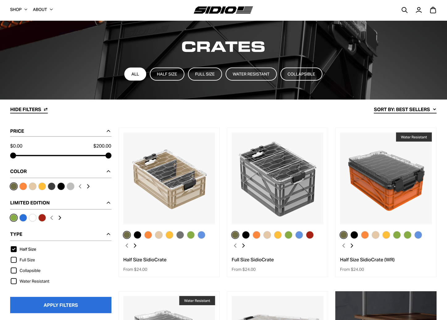
Updated catalog page.
4. Accessories that were hard to find
Lids, dividers, and add-ons are essential to how people use Sidio crates, but most shoppers never saw them. They were hard to find or hidden on separate collection pages. Sidio was missing key opportunities to increase AOV.
How we fixed it:
We introduced multiple touchpoints to bring accessories into the buying journey. That includes in-PDP cross-sells, in-cart upgrades, post-purchase upsells, and an easy-to-find page in the mega menu.
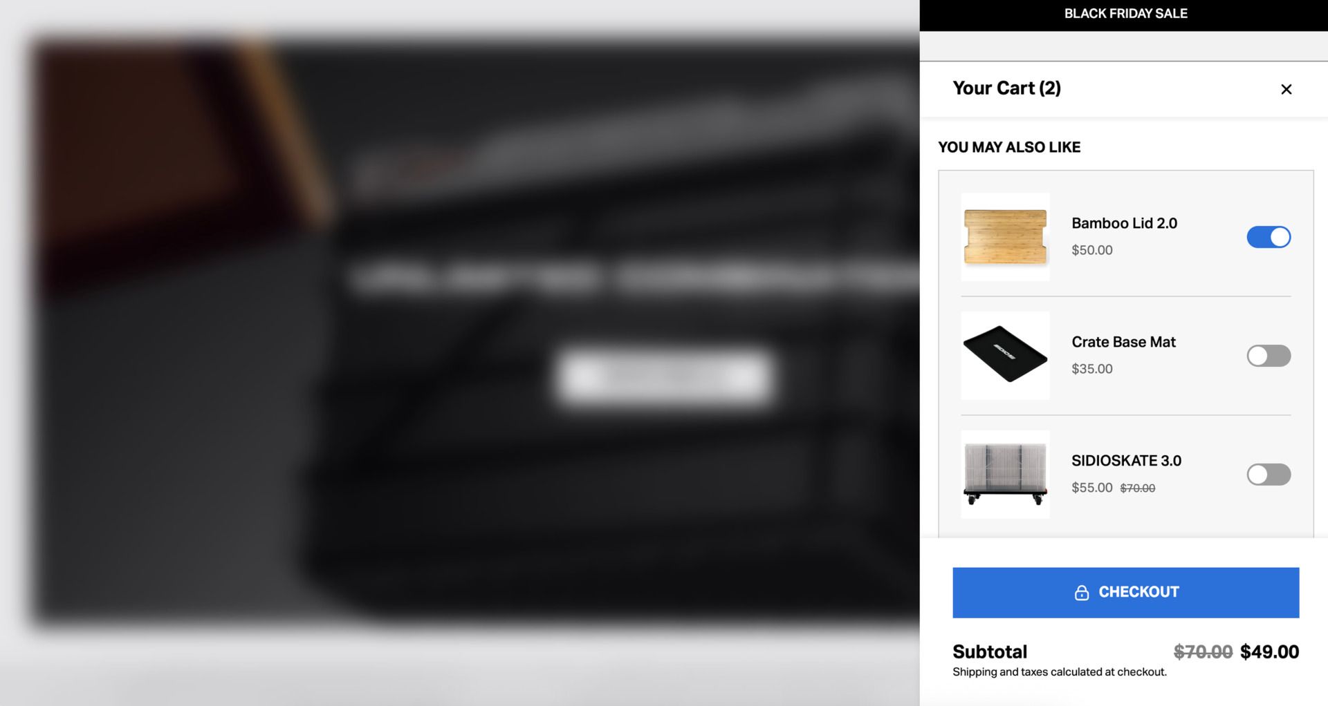
In-cart cross-sells.
5. A complex kit builder need that apps couldn’t solve
Sidio wanted a clean way to sell bundles (or kits as they like to call them), but out-of-the-box solutions were clunky and unreliable. They didn’t match the design of the store.
How we fixed it:
We designed and built the first version of Platter’s kit builder template. It lets customers choose their crate, switch colors, and configure accessories with dynamic imagery that updates in real time.
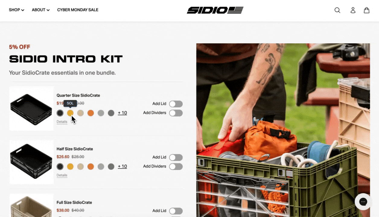
The custom kit builder.
I’m a big fan of this store. And the entire brand. I didn't know crates could ever be this cool tbh.
Everything about the physical product is simple, structured, and easy to understand.
The irony is their old store was the opposite. It was hard to find things, hard to understand the options, and hard to piece together a setup that made sense.
The team brought that same sense of order into the storefront and made it easier for customers to find what they were looking for.
If you want to chat about this build or see if we can help clean up your store in a similar way, shoot me a dm or schedule a call with the team.
Talk next week.