- Platter Newsletter
- Posts
- 8 ways we improved onewith’s store
8 ways we improved onewith’s store
A behind-the-scenes look at how we redesigned and rebuilt onewith’s Shopify store.
Cam Wind
November 04, 2025

Hey, it's Cam 👋
We’ve got a fun one today. Last week, Hayley Segar and the onewith team launched their new Shopify store (built by Platter). It’s a night-and-day upgrade in look, feel, and UX. Our team is really excited with how this one turned out.
Today’s issue is a behind-the-scenes look at what improvements we made and some of the early feedback from the onewith team.
But, before we dive in...
Just wanted to remind you about The Ultimate Shopify Homepage Collection we published last week.
It’s a Notion gallery featuring 1,000 of the best Shopify homepages, fully categorized by industry. It's pretty cool.
Fun fact: One of our designers called it “the best design resource we’ve used.”
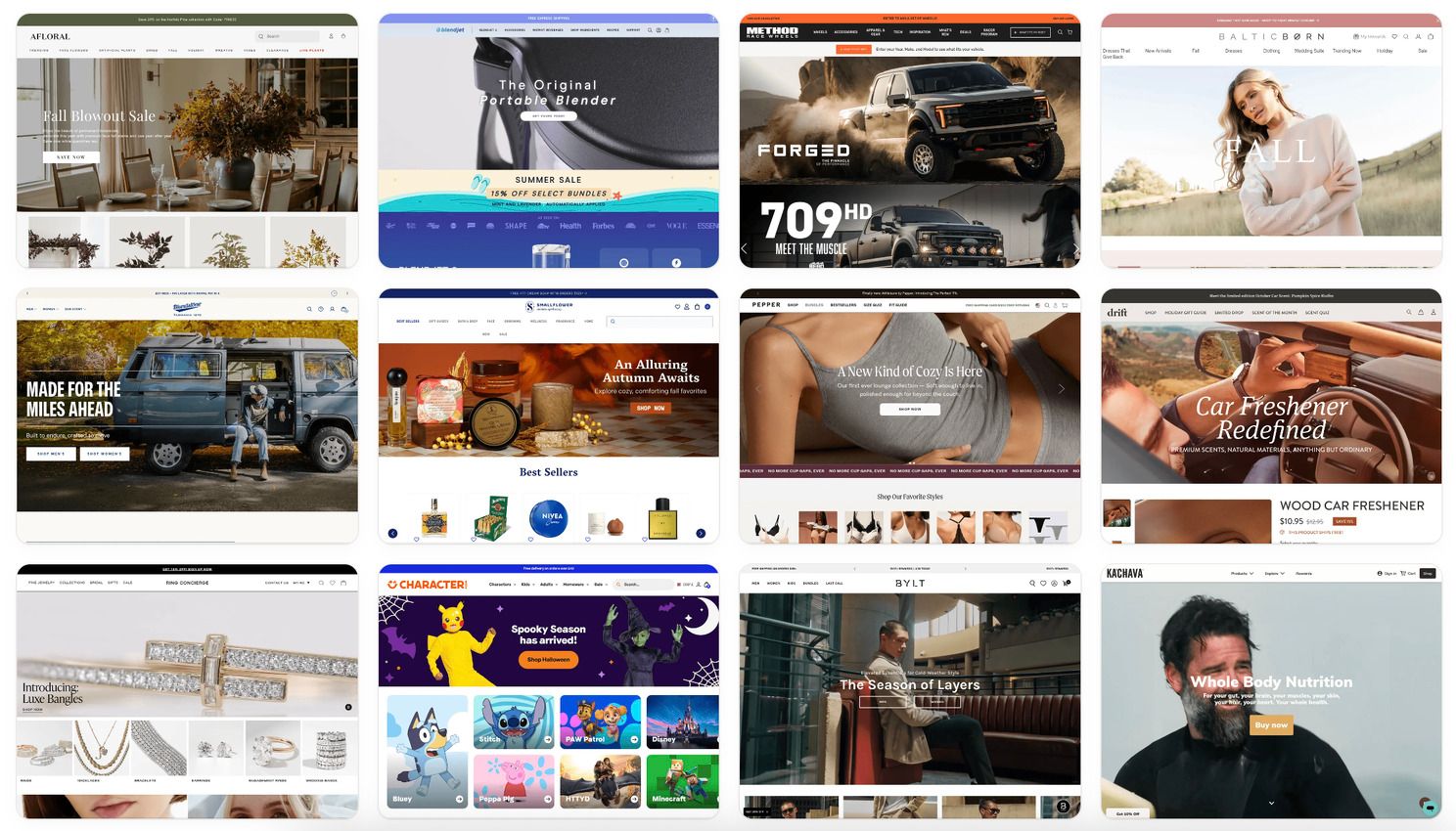
Whether you’re in fashion, beauty, or pet care, it’s packed with design ideas to help you optimize your store and build a homepage that converts.
Now, back to our regularly scheduled content.
How Platter helped rebuild onewith’s new Shopify store from 'the inside out'
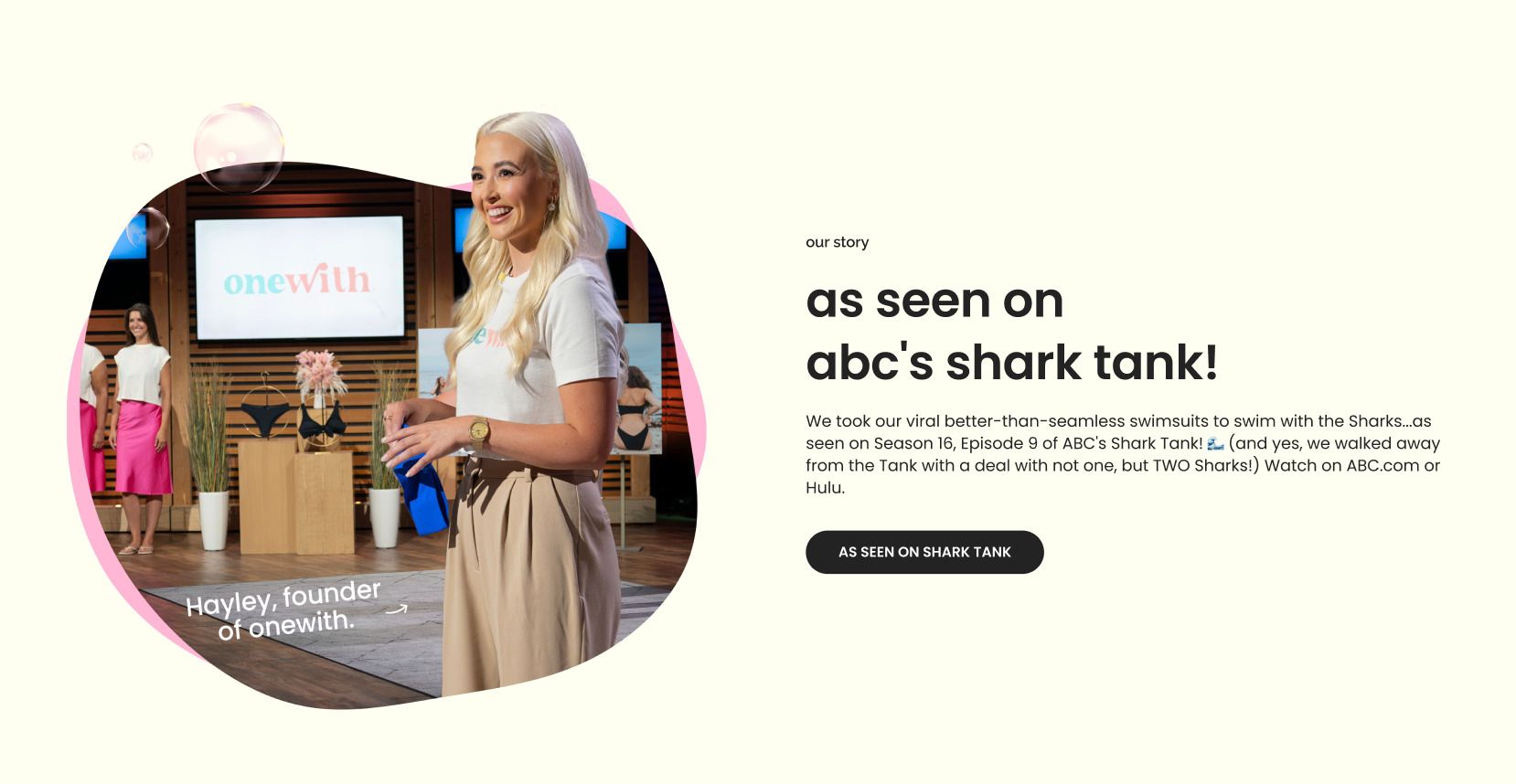
If you’re not familiar, onewith is a swimwear brand founded by Hayley Segar, known for its patented, seam-free “second-skin” design that fits like it’s part of you. After appearing on Shark Tank, the brand has grown quickly, building a loyal community and redefining comfort in the swimwear category.
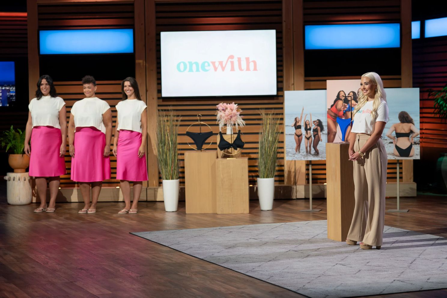
Hayley securing a deal on Shark Tank
The onewith brief
When we first met Hayley, she was doing a killer job. She’d built a strong brand but admitted that their Shopify setup was limiting. She was doing most of the design work in Canva, and most updates required a freelance developer to implement changes.
The store wasn’t “broken,” but it had growing pains. As Hayley wrote on LinkedIn, it “had major performance issues that couldn’t be patched.”
“I’m not one of those compulsive site-revamp founders who needs a new site every 6–12 months; I actually believe in finding something that works and sticking with it. Which is why it pained me to come to the realization that the last version of our site — which we had just launched less than a year ago — had major performance issues that couldn’t be patched.”
She wanted to rebuild from the ‘inside out’ — keeping onewith’s signature personality/look while improving performance, usability, and flexibility for her team.
“We just needed a different setup for our specific business needs. It was time to rebuild with integrity from the inside out.”
Our build process
We started with a full strategy audit to understand what was working — and what wasn’t. The goal was to keep the personality and brand elements that make onewith unique, while improving how the store performs and how easily the team can manage it.
This project also gave us time for deeper discovery. Hayley had a clear creative vision — the waves, icons, and playful curves that define the brand — so our focus was refining those details and giving them more structure and consistency.
As our designer put it, “It had personality, but the store lacked structure.”
From there, strategy, design, and development worked hand-in-hand to bring the new experience to life — resulting in one of the cleanest Figma-to-Shopify launches we’ve ever done.
Here are eight improvements we made to onewith's store:
1. Modernized the design
The problem: The old design captured onewith’s personality but lacked structure and consistency. It was built mostly in Canva with default Shopify elements, which limited flexibility and made the brand feel smaller than it really was.
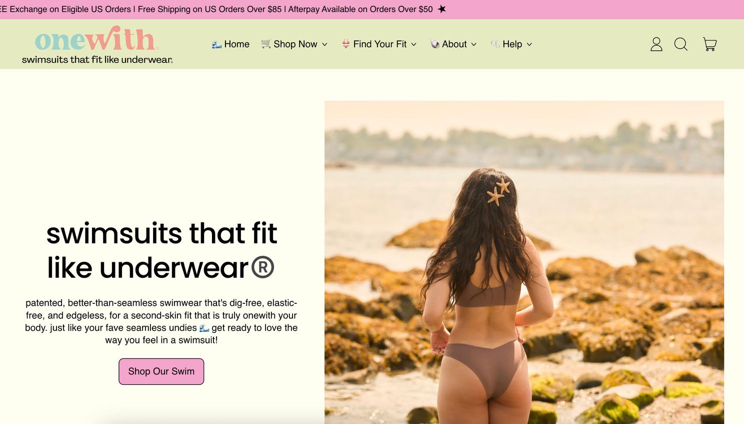
The previous homepage design
The solution: We rebuilt the entire design system, simplifying colors, icons, and creating a flexible component library. The updated design maintains onewith’s playful energy but matures the brand. Floating bubbles, parallax motion, and curved text make the store feel alive without slowing the site down.
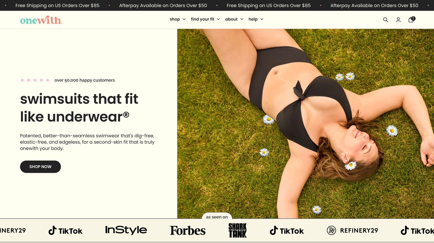
The updated homepage design
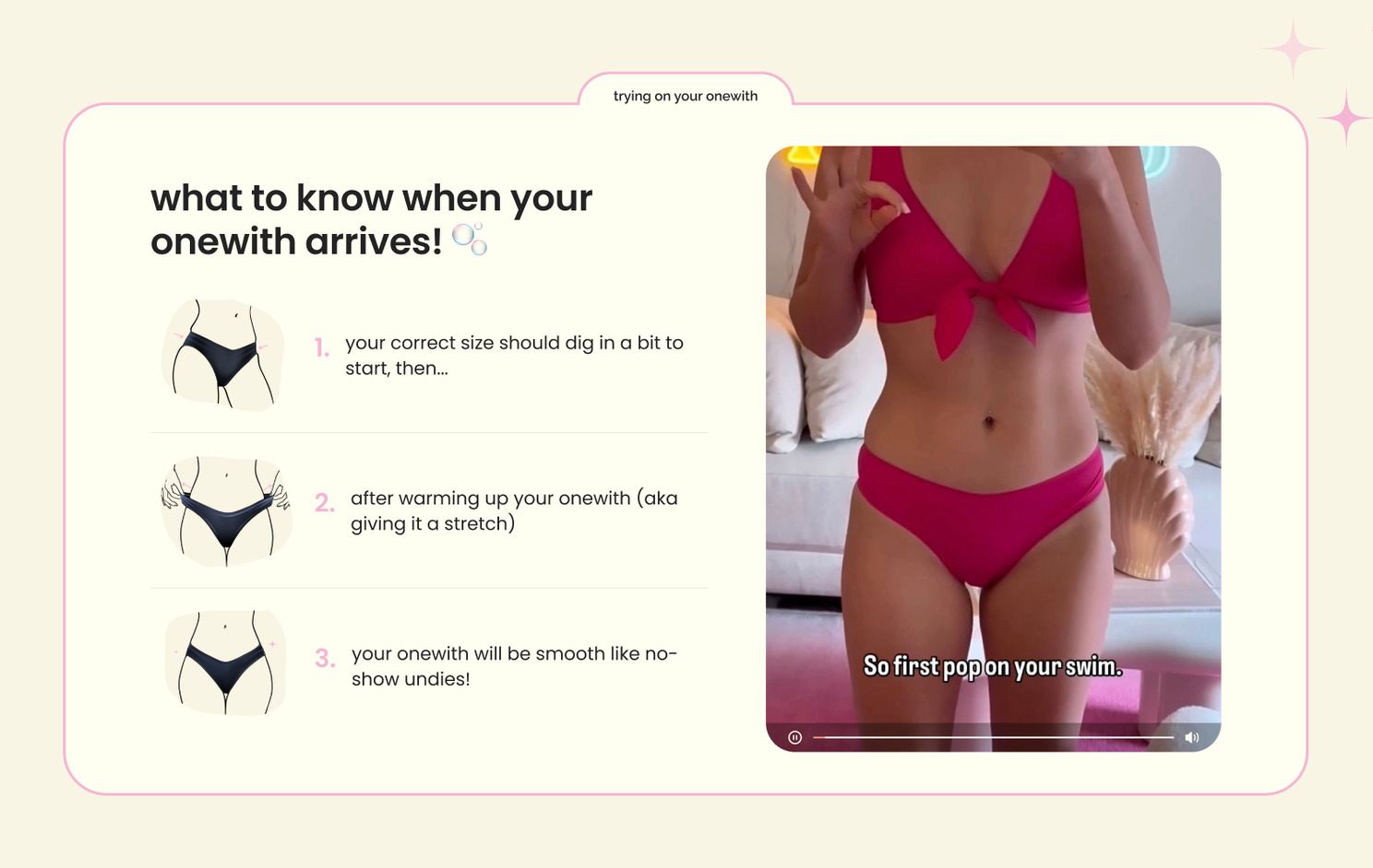
2. Added education to reduce sizing confusion
The problem: onewith’s swimwear fits snug at first, then stretches to feel “second-skin.” Customers often thought their item was the wrong size, which led to confusion and unnecessary returns.
The solution: We built fit education into the shopping experience. Every PDP now includes a “how it should fit” module with visuals showing too tight, too loose, and just right. We also created a dedicated Learn page and added educational content to the mega menu — ensuring customers understand sizing before checkout.
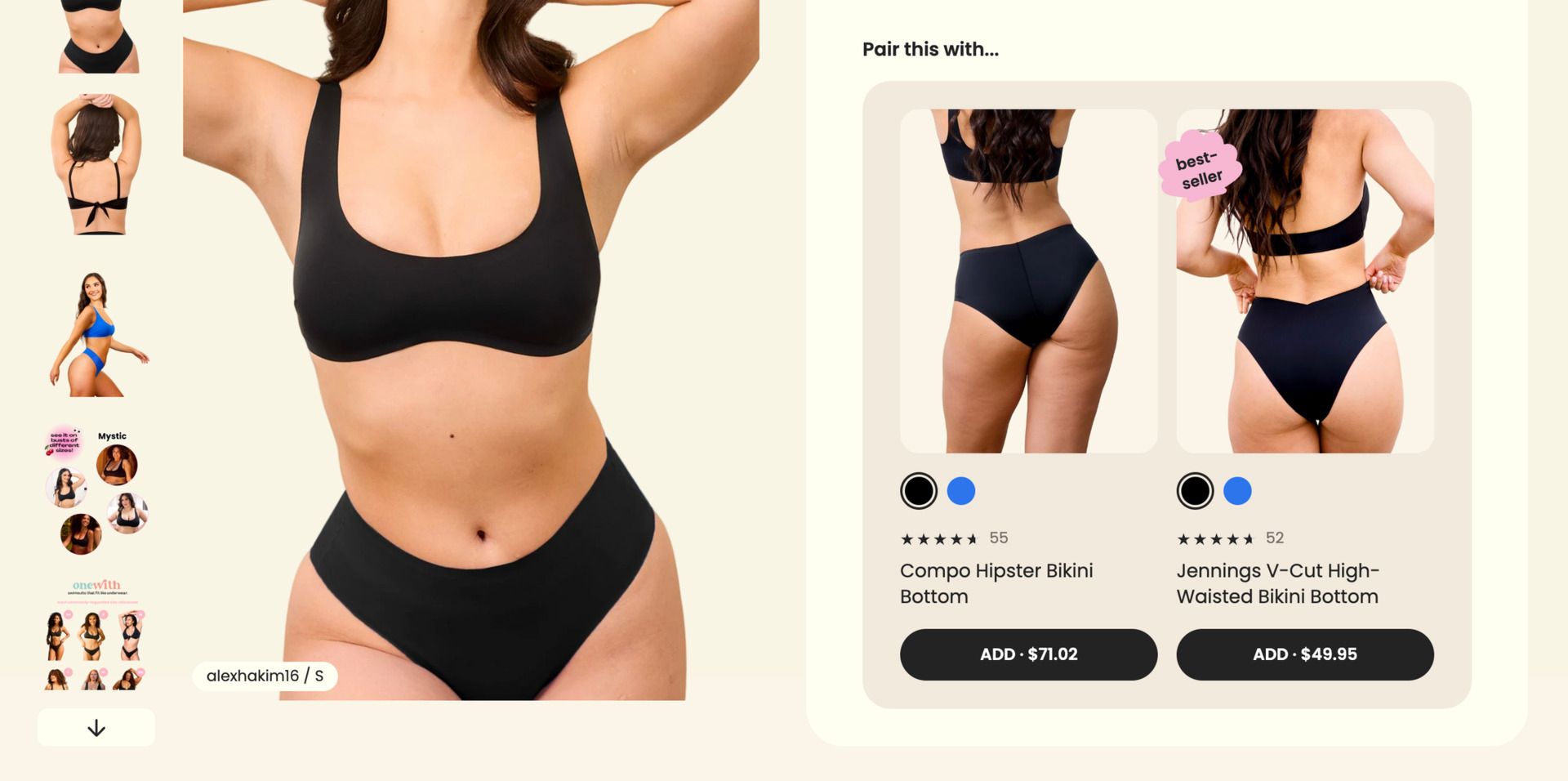
3. Smarter product discovery
The problem: Customers loved mixing and matching tops and bottoms, but the old store made it confusing. Product imagery included tops and bottoms making, it difficult for shoppers to know what item they were looking at. Plus, they were missing relevant cross-sells on their product page to complete their set.
The solution: We built a “Complete the Set” feature directly in the buy box so shoppers can add matching pieces without leaving the page. Product cards now include color swatches and dynamic galleries that update automatically based on size.
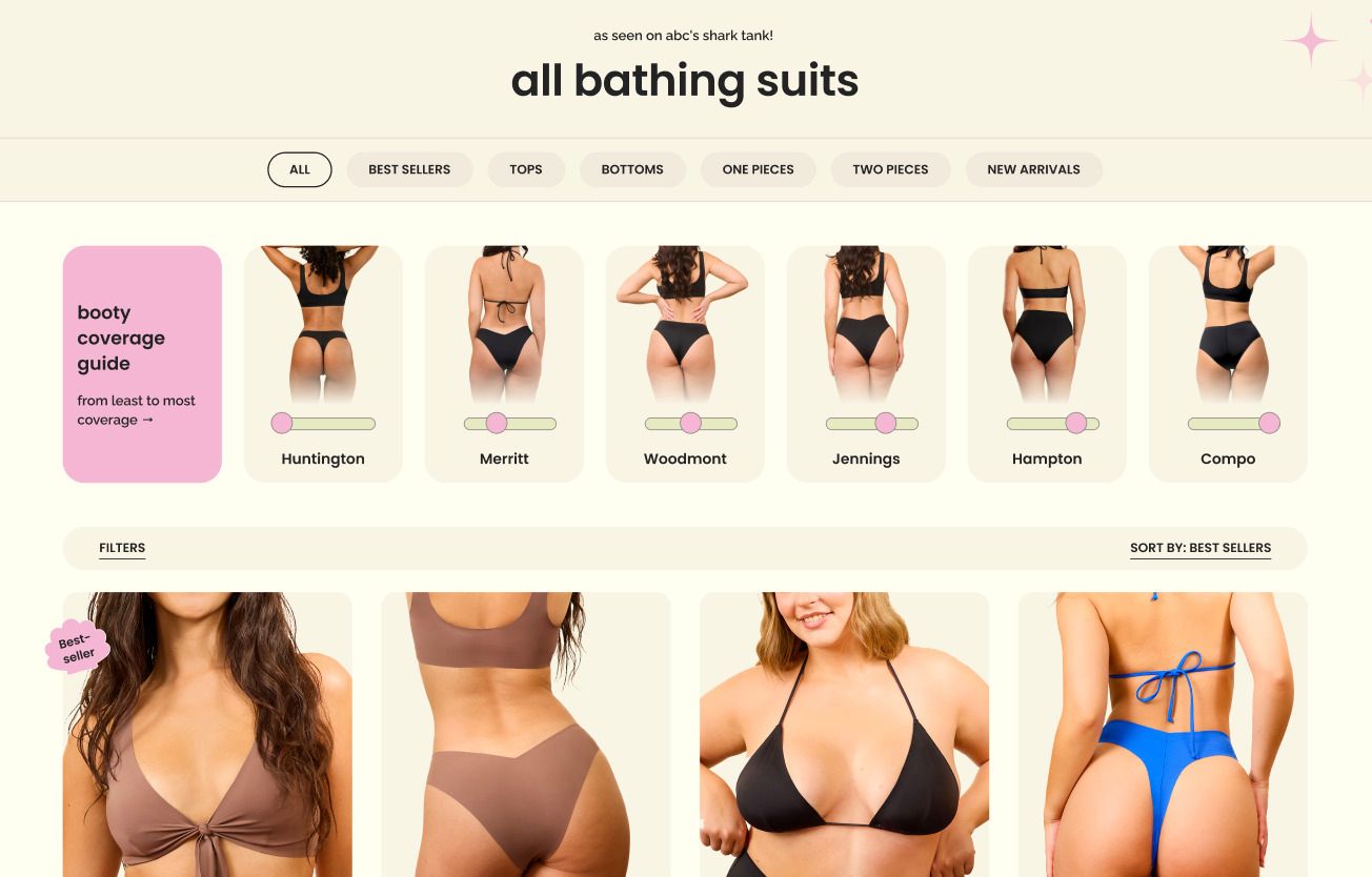
4. Booty coverage guide
The problem: Heatmap data showed that shoppers kept clicking a static graphic comparing different coverage styles — even though it wasn’t interactive.
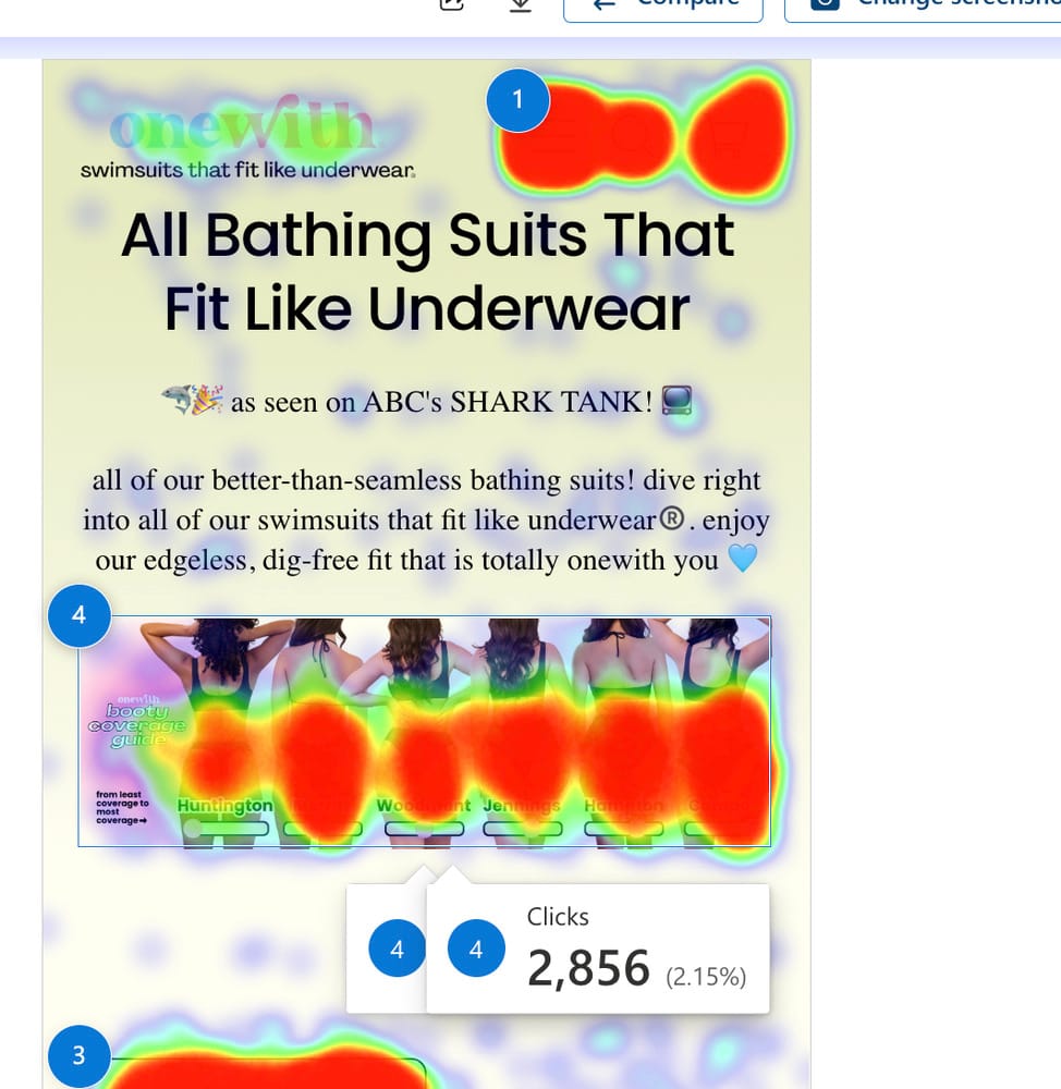
The solution: We turned that insight into a real feature. The new “Booty Coverage” guide lets customers filter products by coverage type right on collection pages.
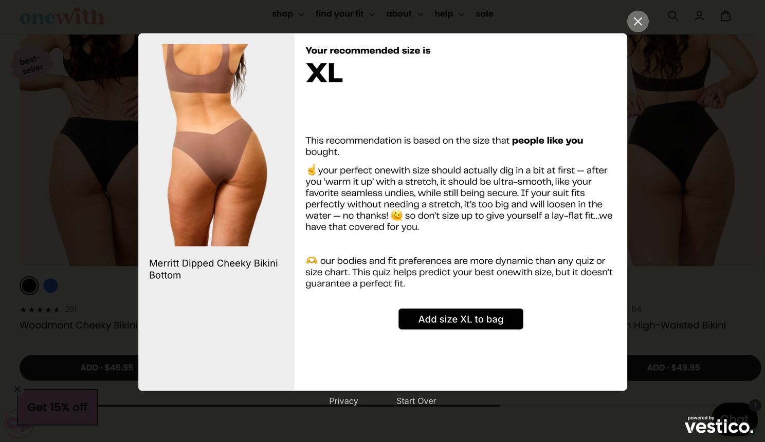
5. Custom integration with Vestico
The problem: onewith had a sizing quiz built using Vestico, but it lived in a separate step — forcing shoppers to leave the PDP, adding unnecessary friction.
The solution: We built a custom Vestico integration directly into onewith’s store. Clicking “Size Help” launches the quiz as a popup modal. When a shopper completes the quiz, it prompts them to add the recommended size to their cart with one click. And when browsing other products, it pre-selects their recommended size in quick add.
6. Personality without impacting site speed
The problem: The previous site used heavy scripts to power animations, which slowed load times and made edits risky.
The solution: We rebuilt all motion natively in Platter’s theme system. Floating bubbles, seashell badges, and gentle hover animations were recreated in a lightweight way — fully editable through the CMS, no developer needed.
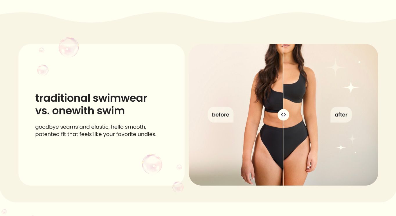
7. Traditional swimwear vs. onewith
The problem: onewith’s biggest challenge was helping shoppers understand what makes their swimwear different. The brand’s patented design uses no seams or elastic — it stretches to feel like second skin — but that wasn’t visually obvious online.
The solution: We built a simple before-and-after slider to show the difference. The new section highlights how traditional swimwear digs in while onewith’s fits smooth, creating an immediate “aha” moment that words alone couldn’t deliver.
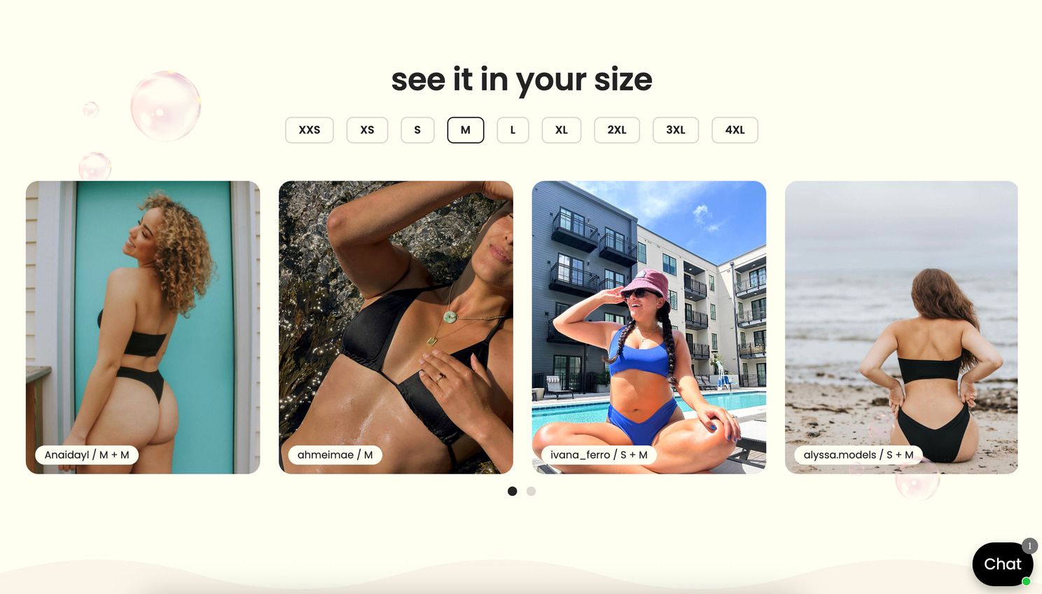
8. See it in your size
The problem: Swimwear is deeply personal — and even with clear size charts, customers often struggle to picture how a style or size will look on their own body type.
The solution: We created an interactive “See it in your size” gallery where shoppers can select their size and instantly see real customer photos wearing that size. It’s a brilliant mix of UGC and UX — helping shoppers feel confident.
Feedback from Hayley and the onewith team
It’s only been two weeks since launch, but the feedback from the onewith team has been incredibly positive.
“Platter understood our vision immediately and brought it to life in a way that’s clean, dynamic, personable, and full of heart.”
Moments like this are what it’s all about.
We love seeing founders share unsolicited feedback and genuine excitement after launching their new store. It’s a reflection of how far the Platter team has come.
Take a look at the new store → onewithswim.com
Thinking about a similar refresh? Schedule a call and we'll provide a free audit of your storefront.